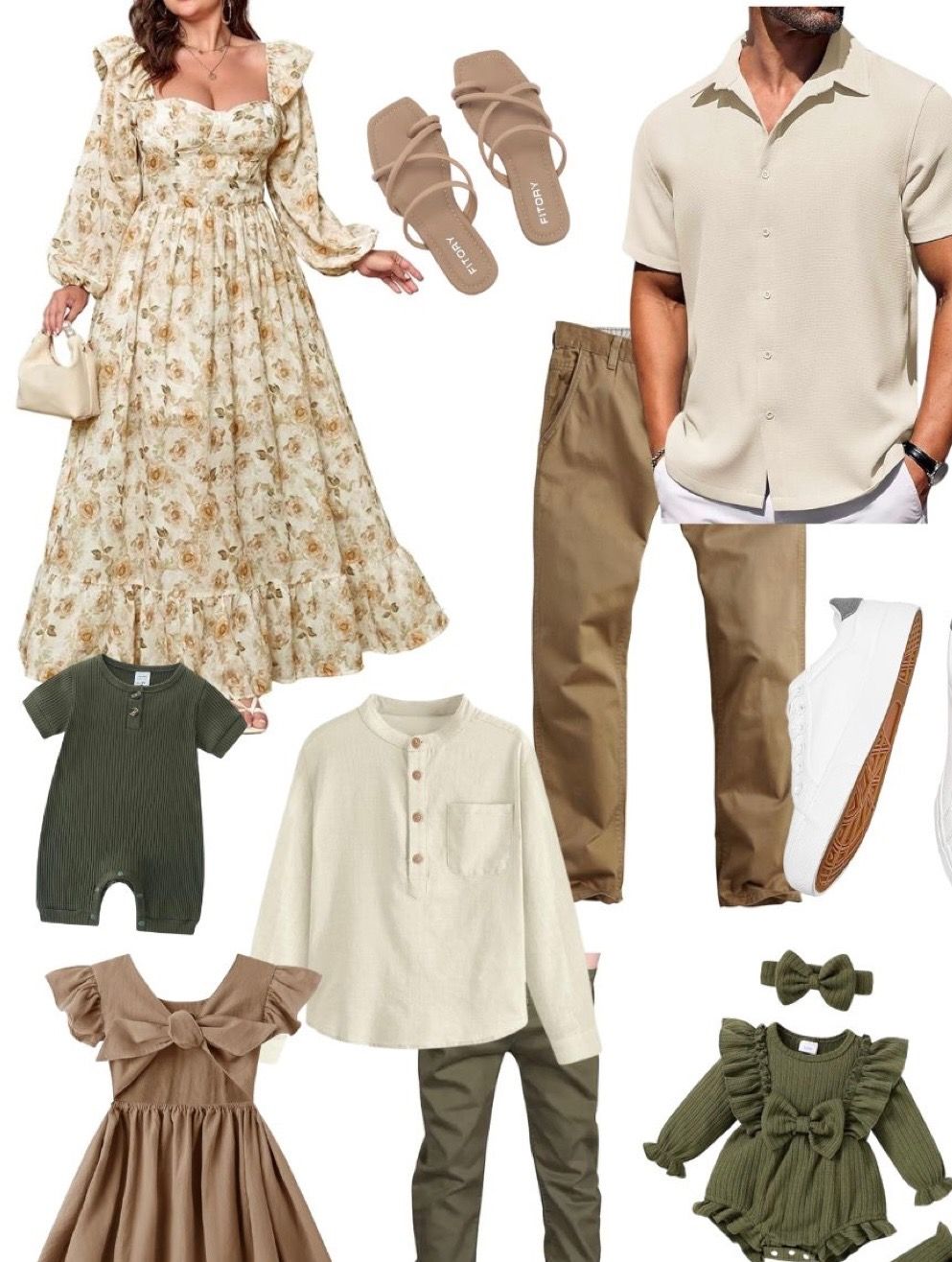
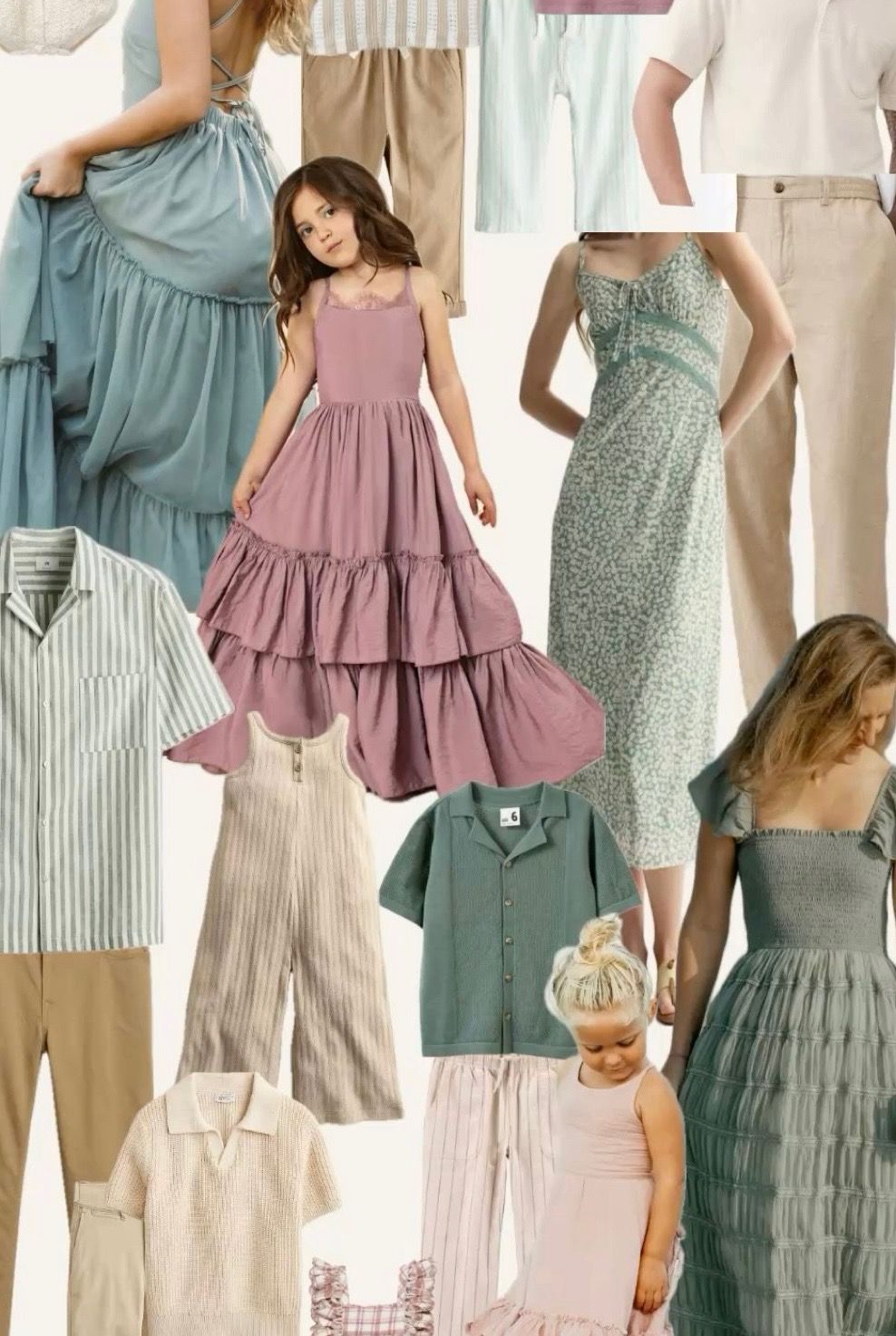
mood BOard
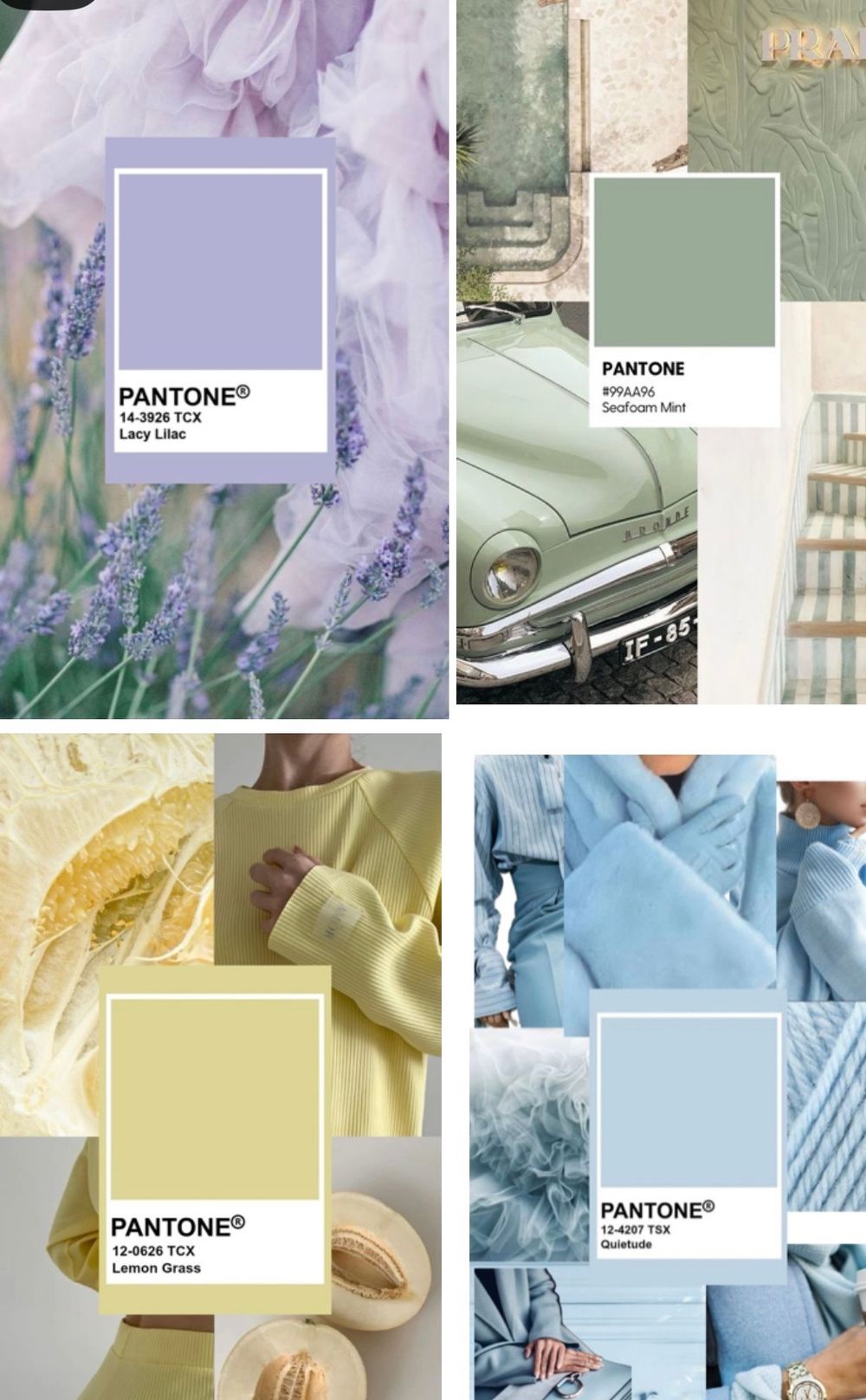
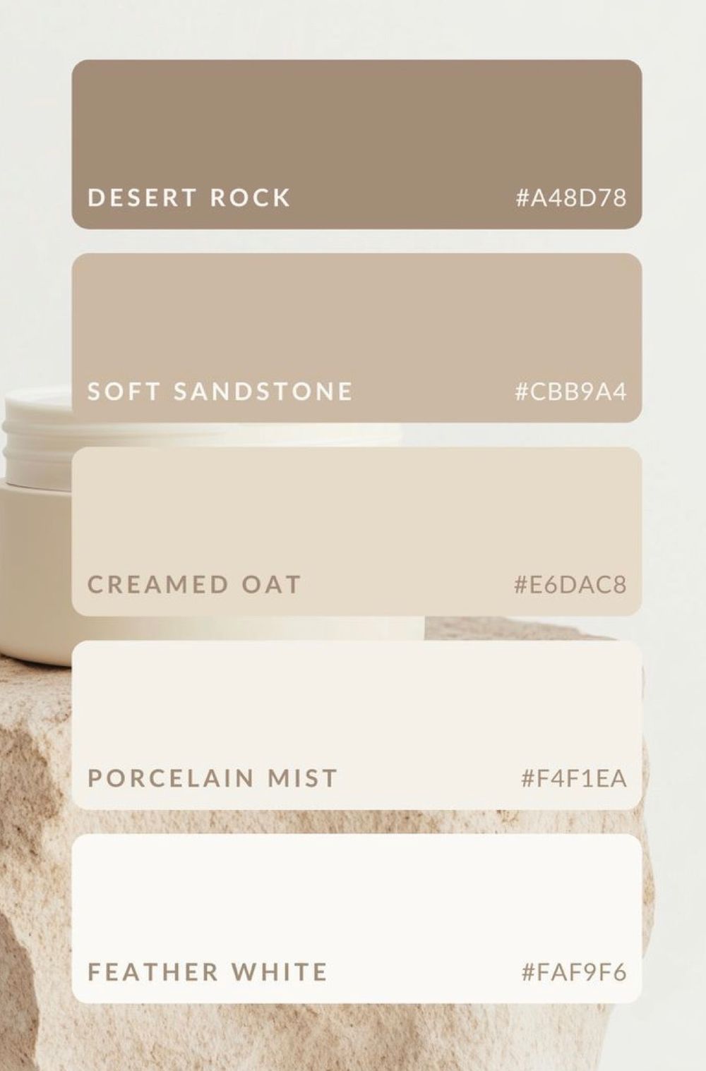
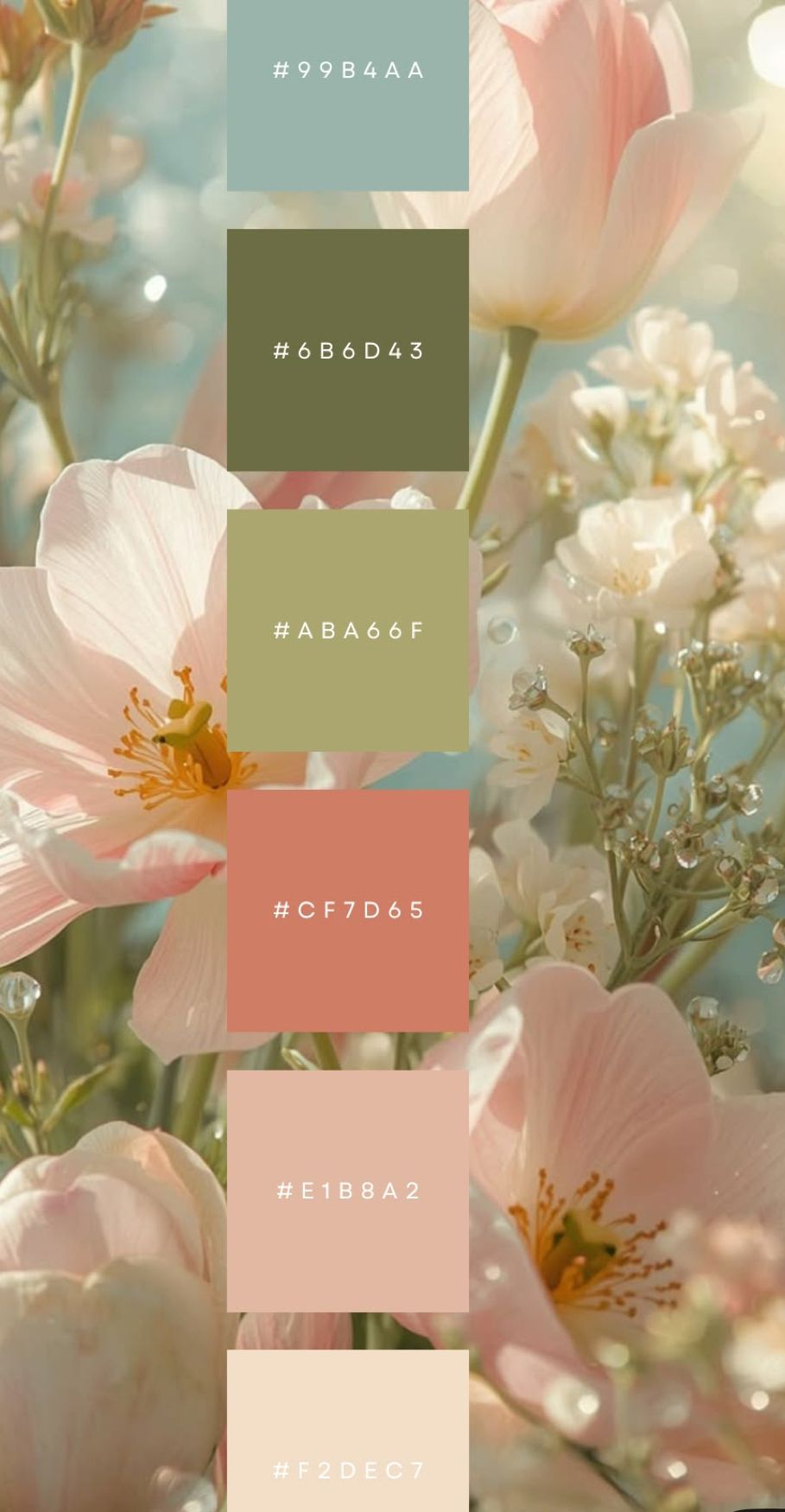
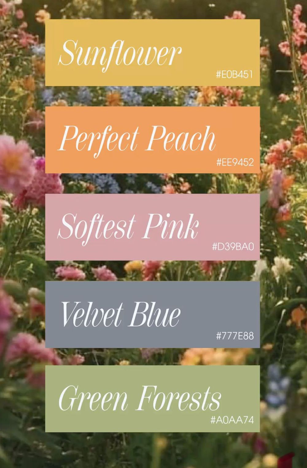
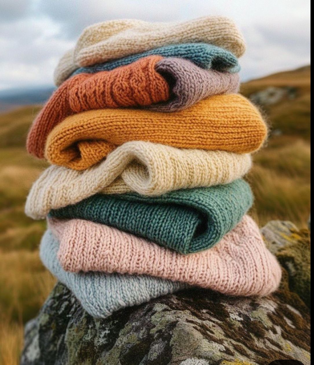
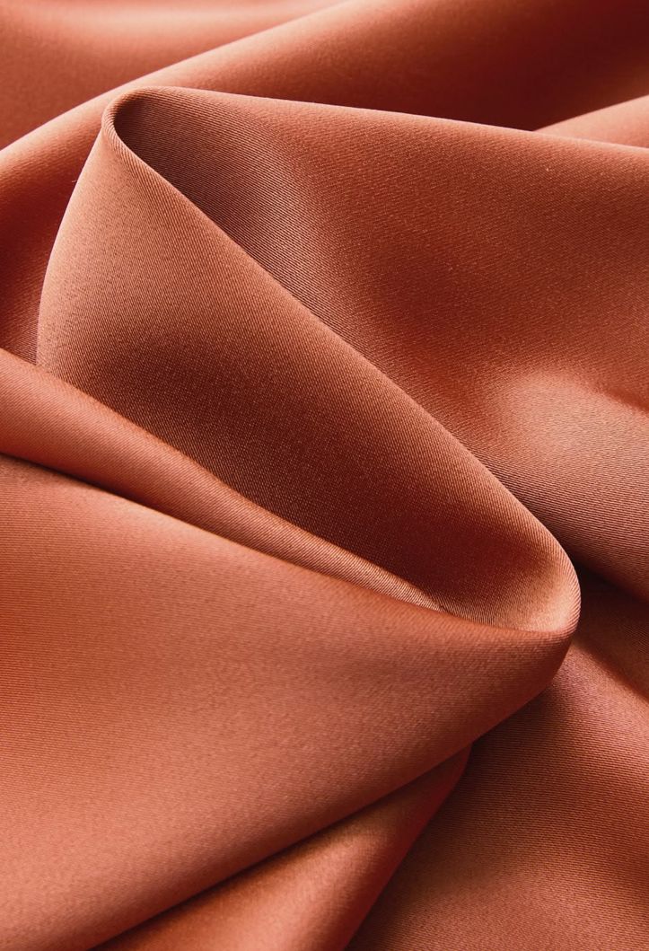
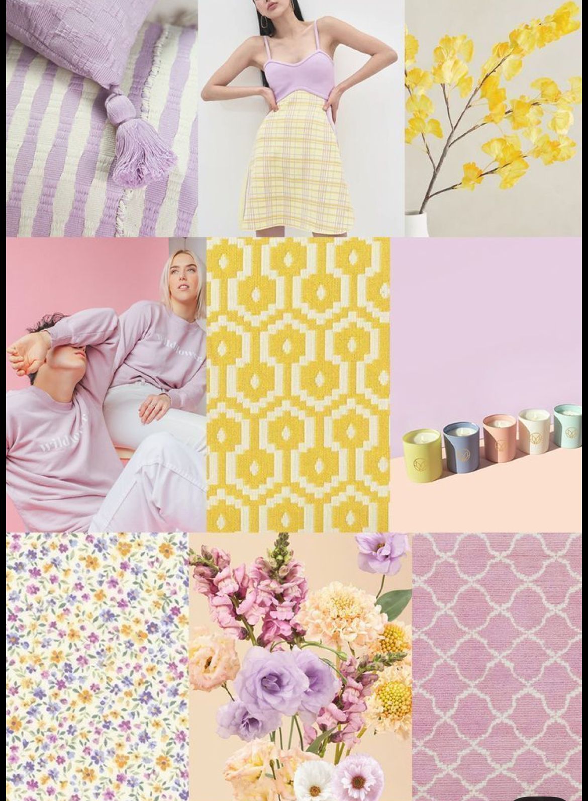
Color
Color sets the entire tone of a session. It influences mood, depth, and how images feel over time.
Soft, cohesive palettes allow connection to stand out, while harsh or competing colors can pull attention away from what matters most.
Choosing tones that work together creates a gallery that feels intentional, timeless, and easy on the eye.

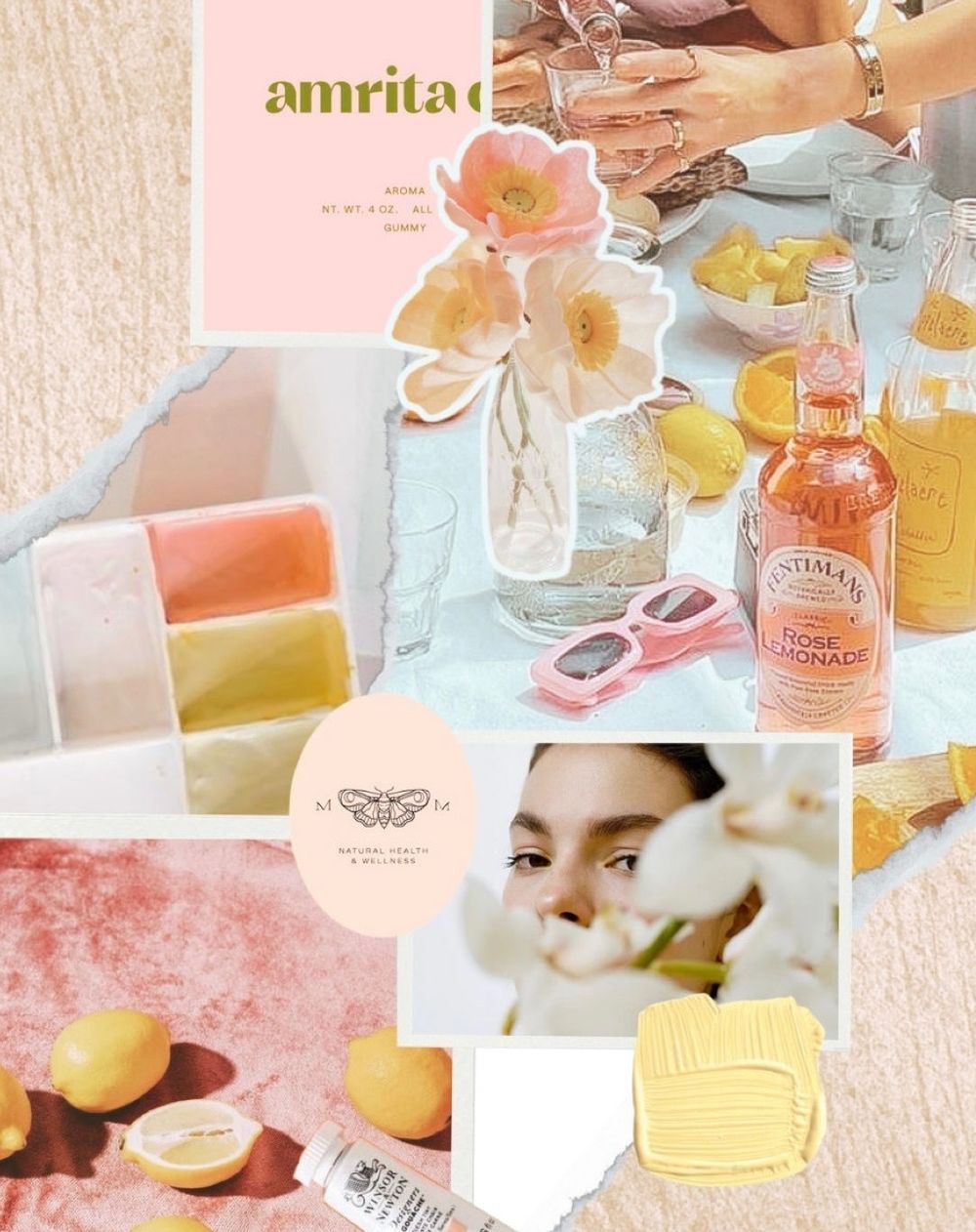

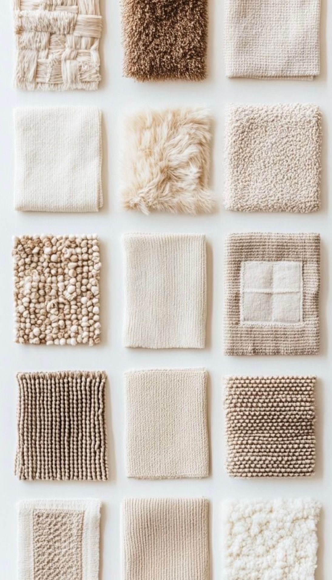
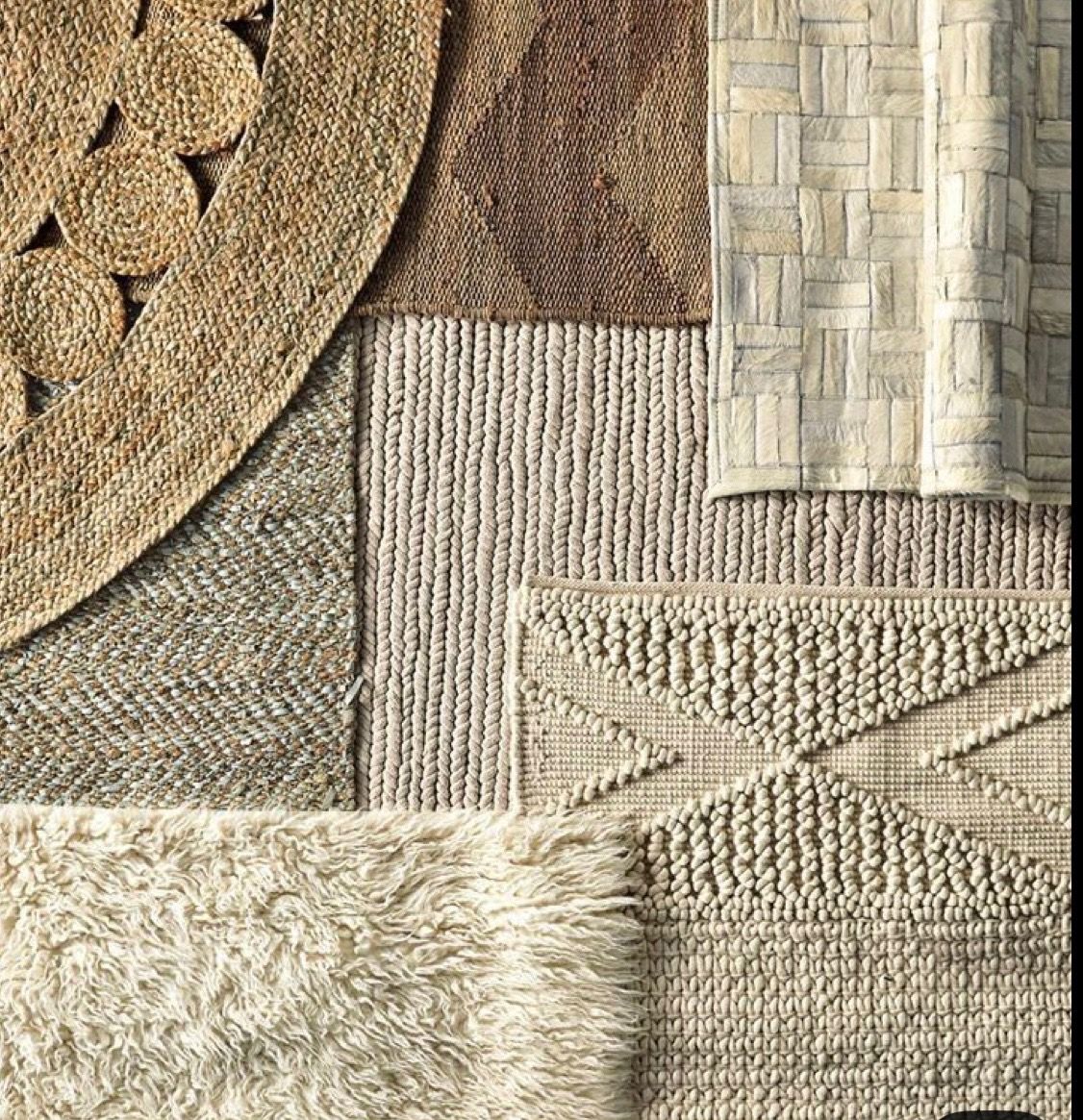
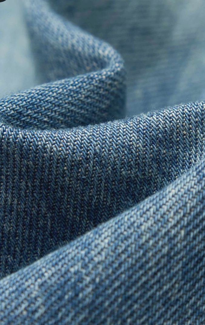
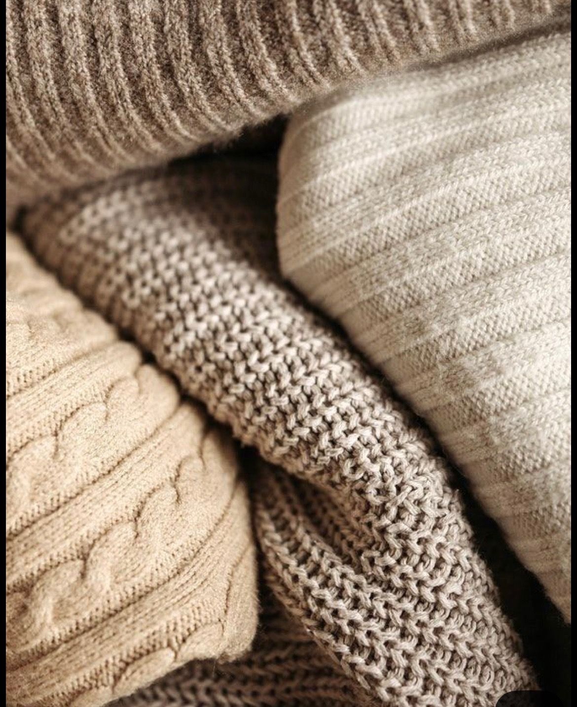
Texture
Texture adds depth and dimension to an image. It’s what keeps a photo from feeling flat.
Soft knits, linen, worn fabrics, and natural materials photograph in a way that adds movement and richness without overwhelming the frame.
When textures complement each other, they create visual interest while still keeping the focus on connection.
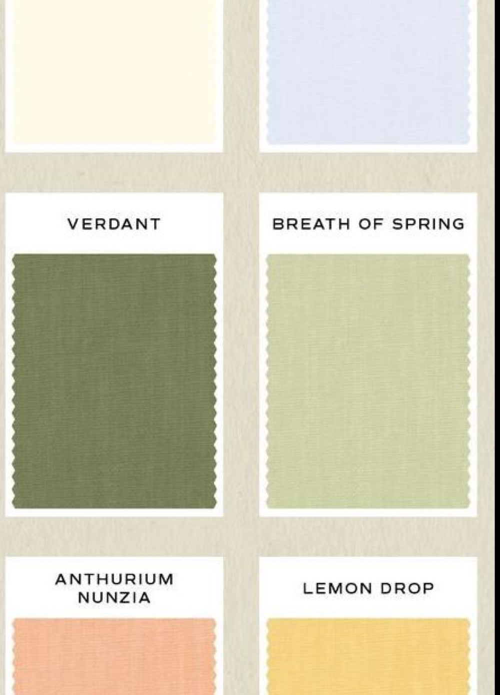
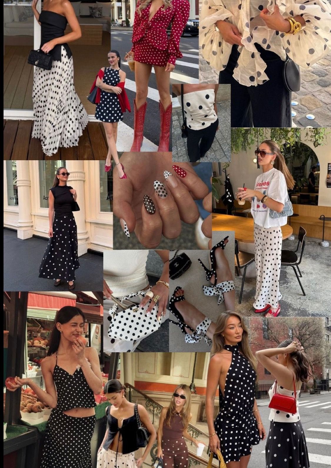
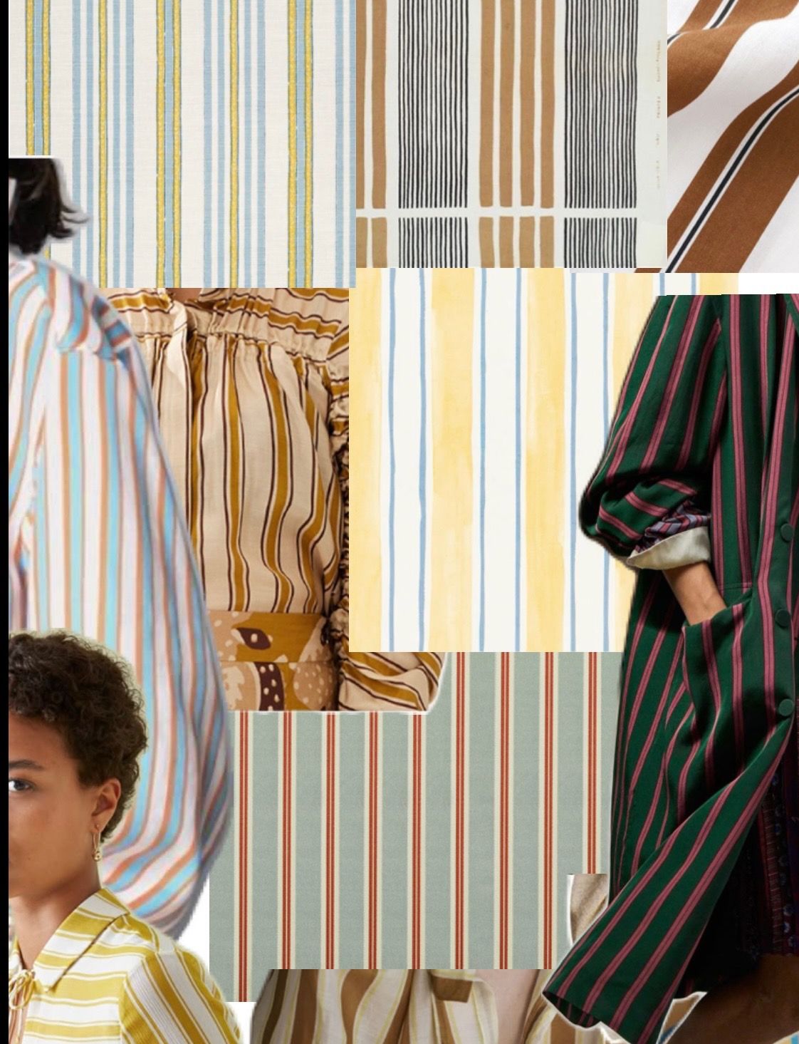
Pattern
Pattern should be used with intention.
Subtle patterns can add personality and variation, but too many or overly bold prints can distract from the moment.
Keeping patterns minimal and balanced allows your images to feel cohesive rather than busy

Final Look
When color, texture, and pattern all work together, everything falls into place.
The result is a gallery that feels natural, cohesive, and true—where nothing competes for attention and every image flows effortlessly into the next.
This is what creates images that not only look beautiful, but feel like you.